Color photographs can be alluring, but also distracting. I’ve taken some not-great photos with rich colors, and was alarmed to learn that my friends love even my worst photos of vivid flowers. (But! But! Wait! Don’t!)
To focus on texture and composition, I’ve preferred to work in monochrome, though I return to color for botany and landscapes.
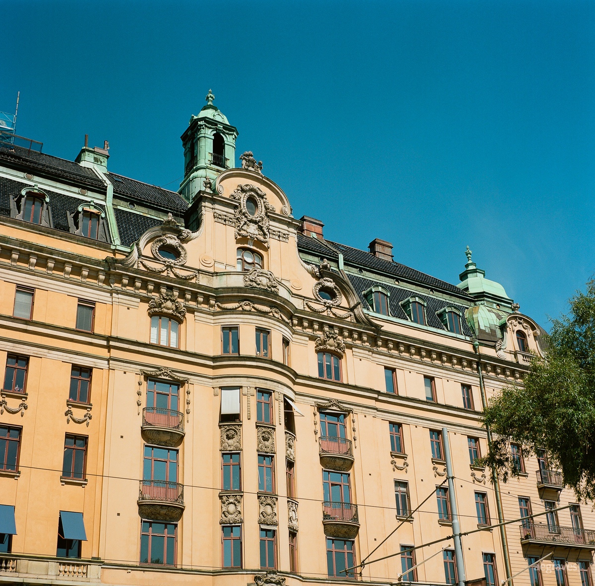
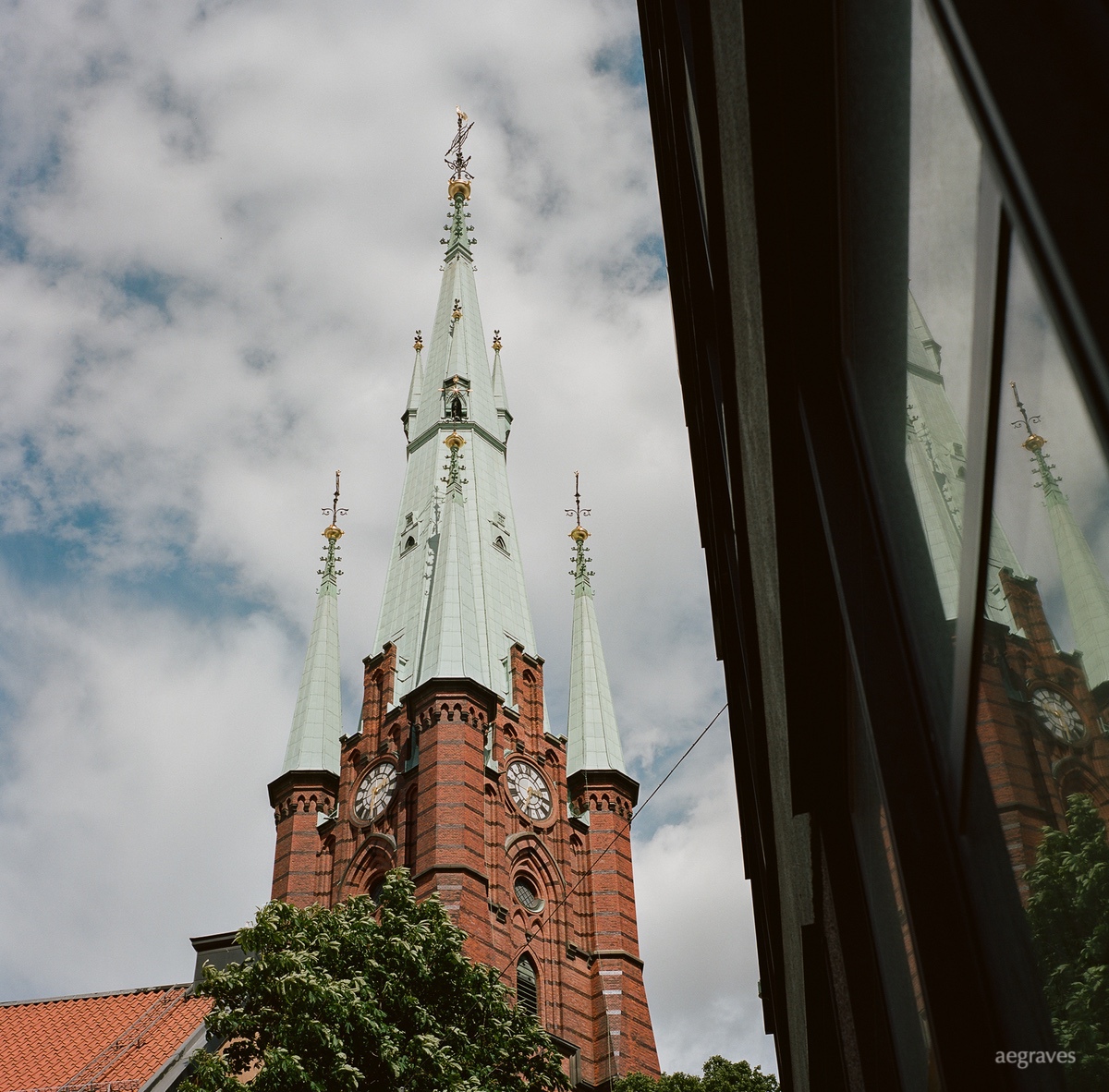
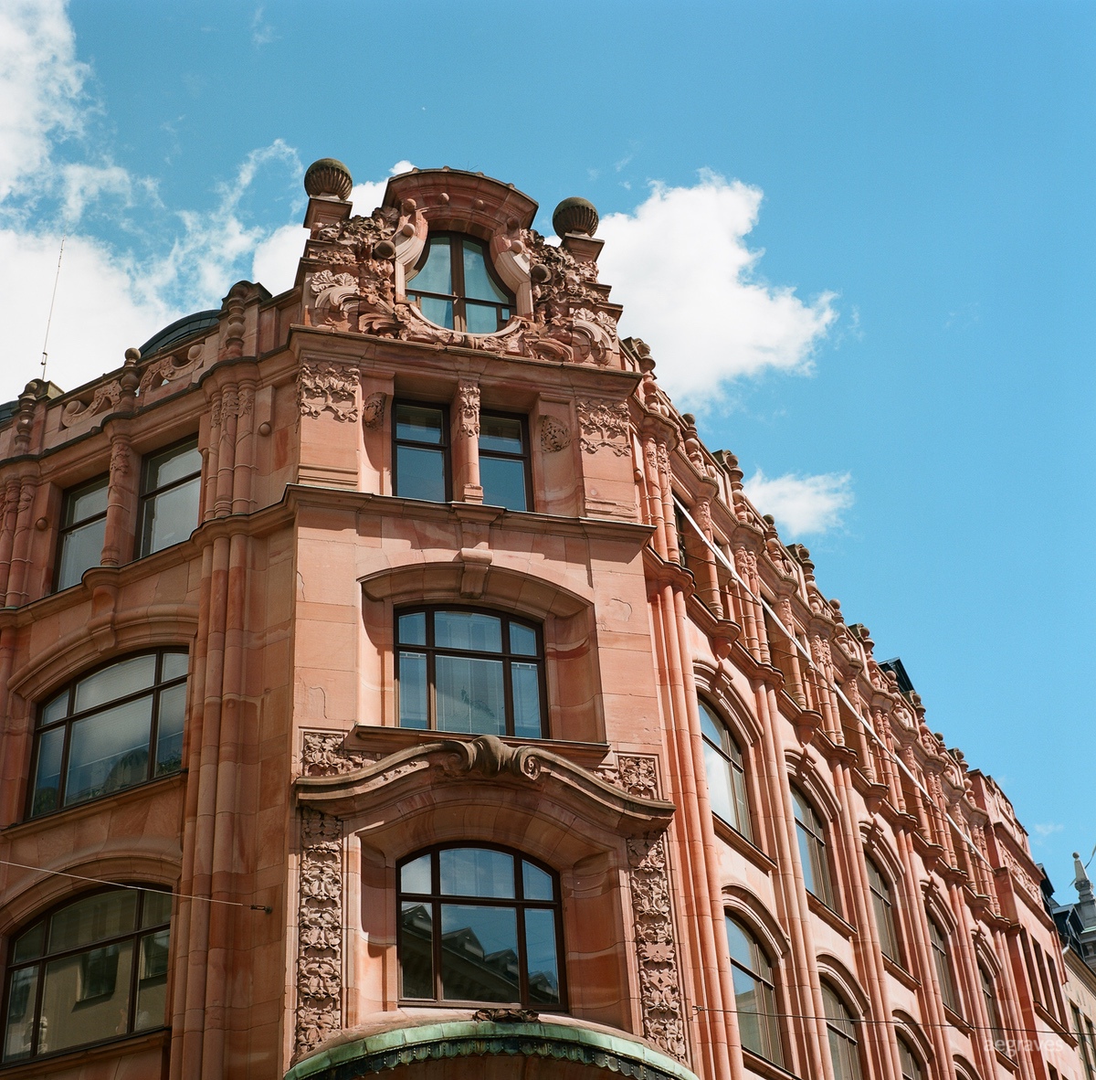
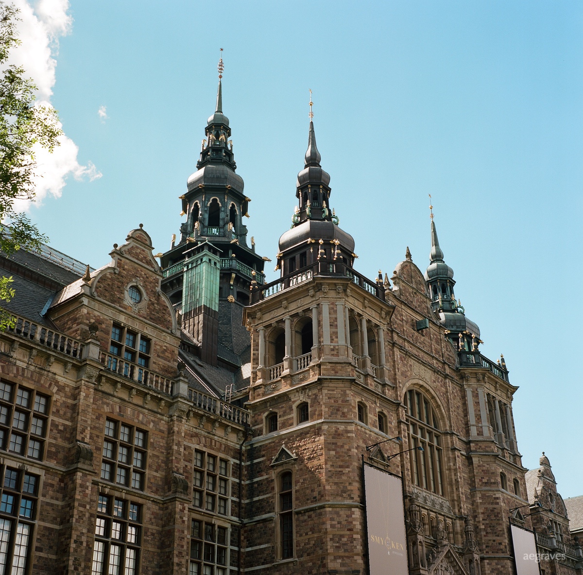
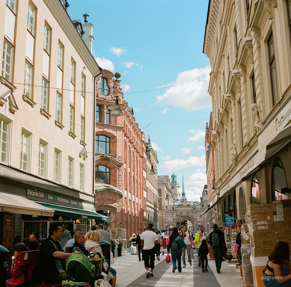
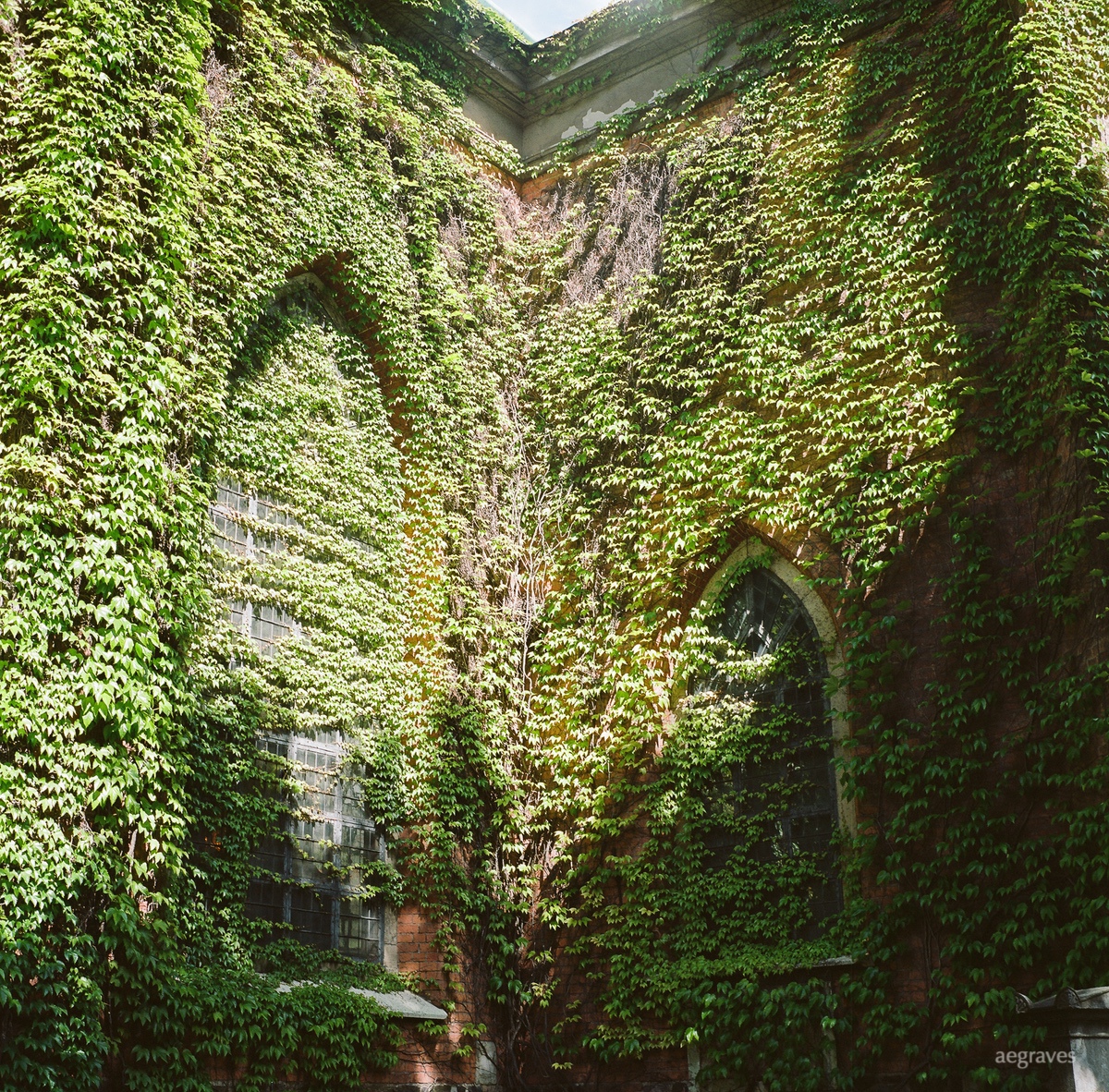
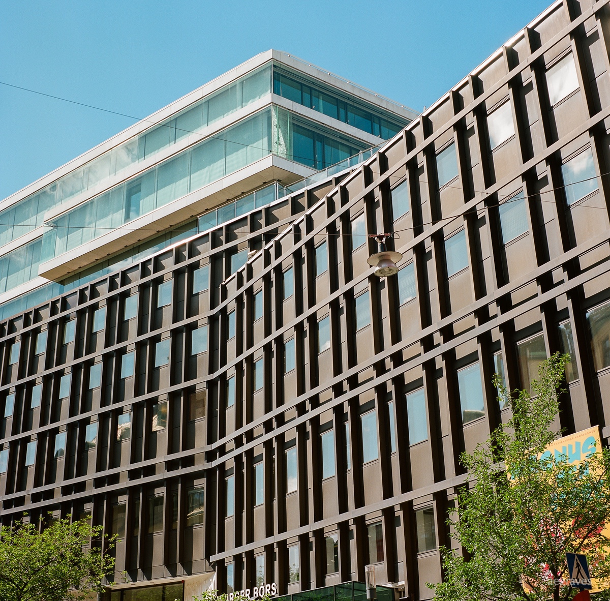
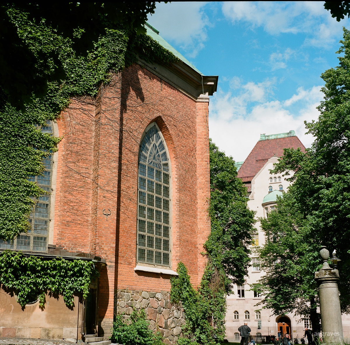
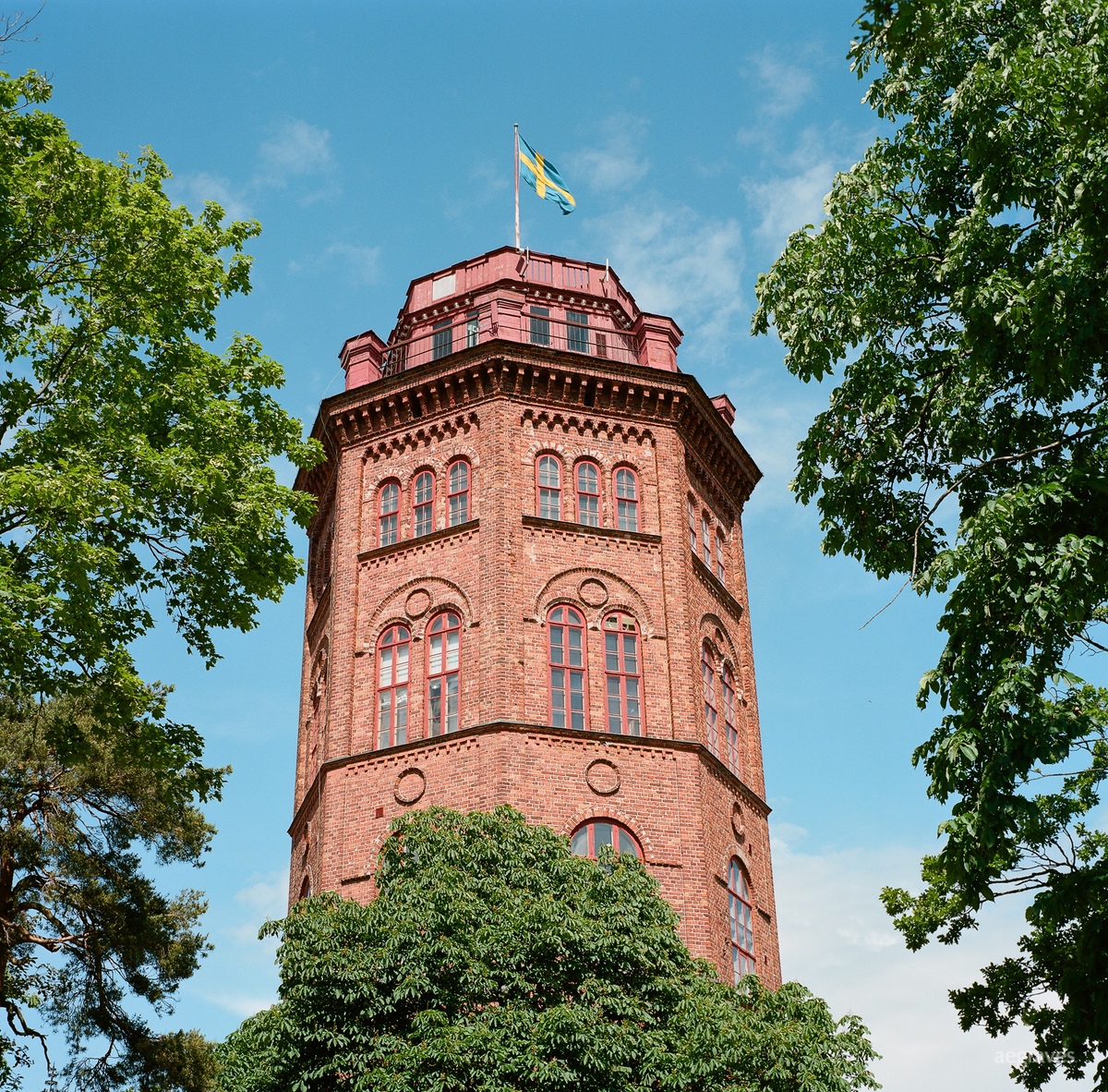
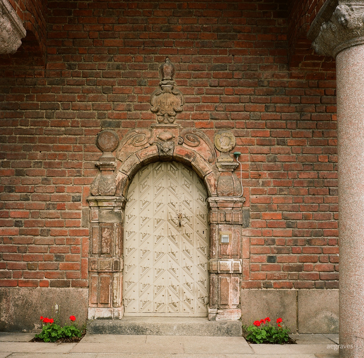
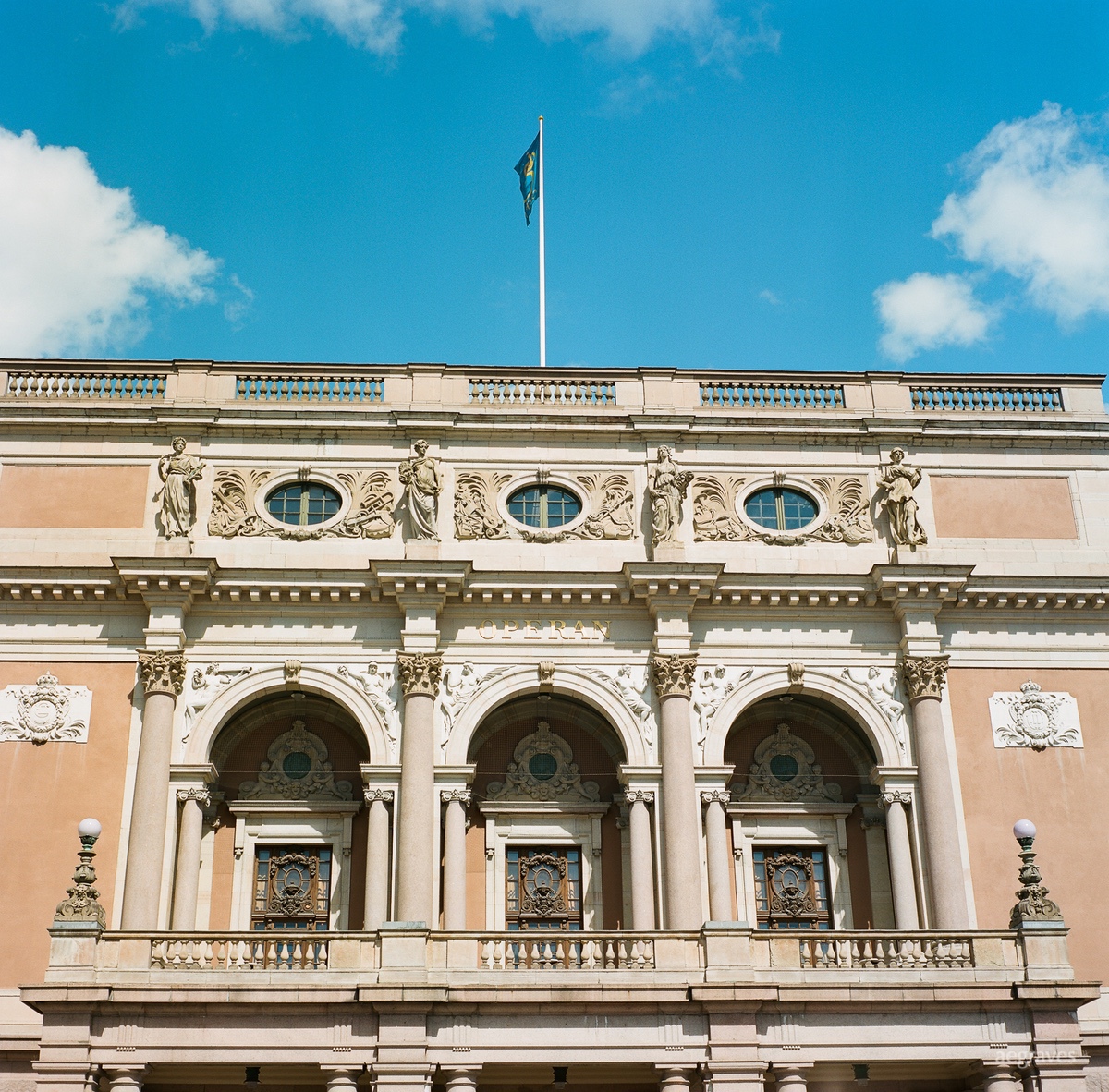
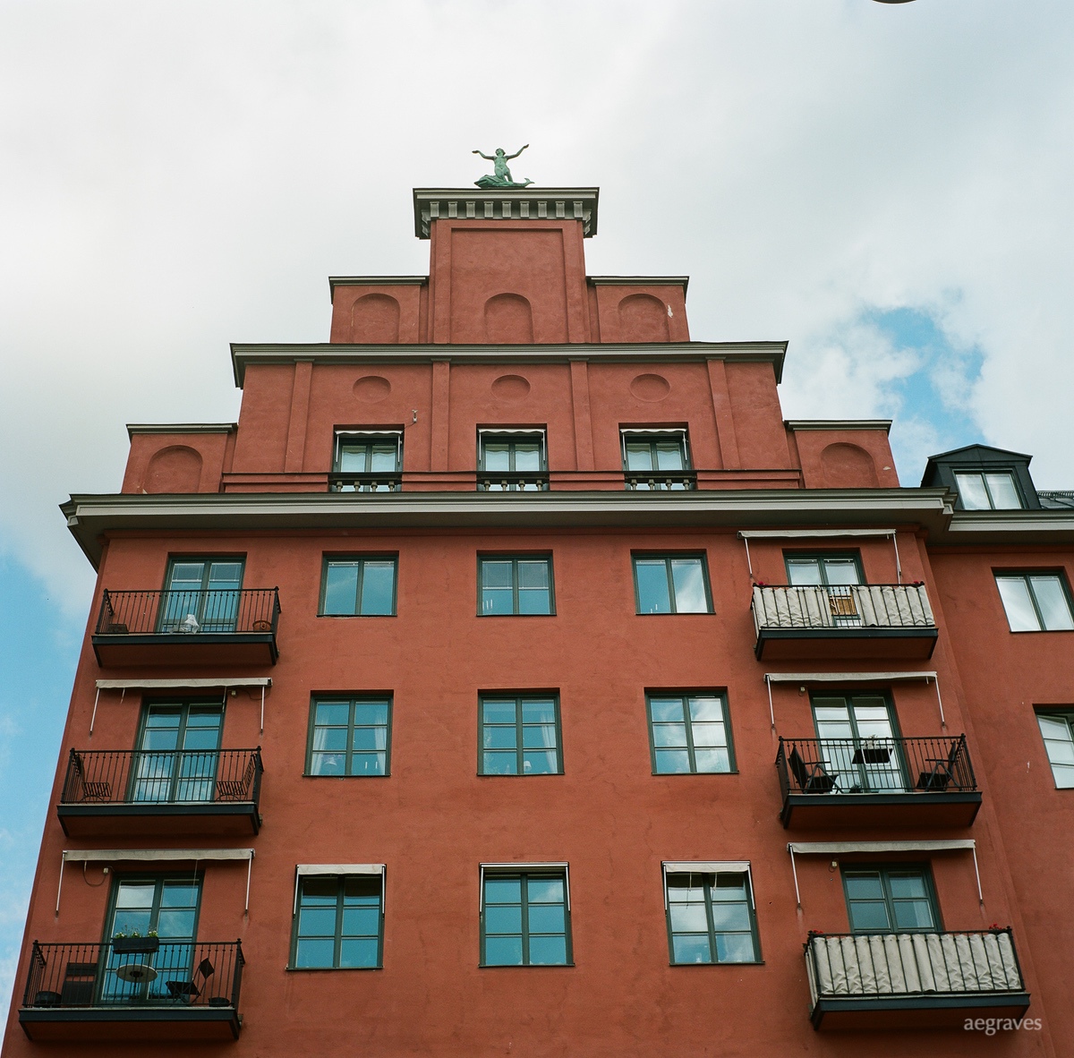
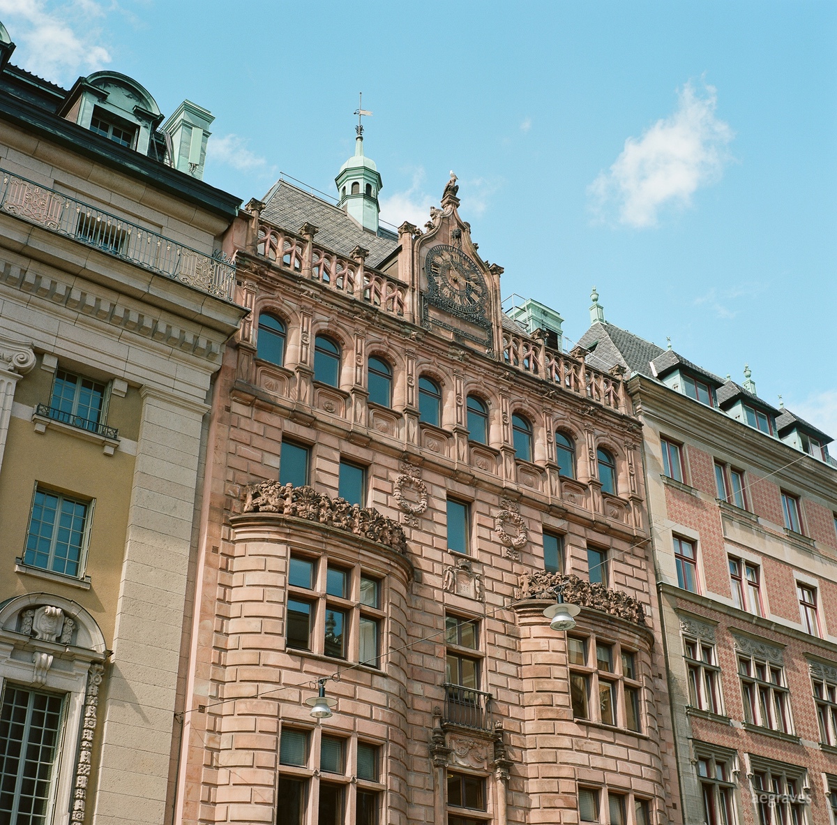
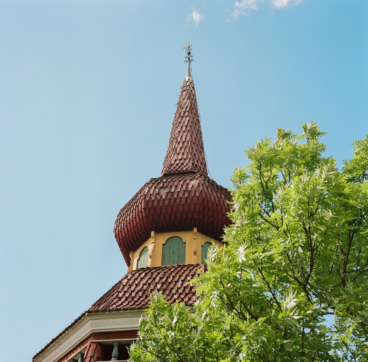
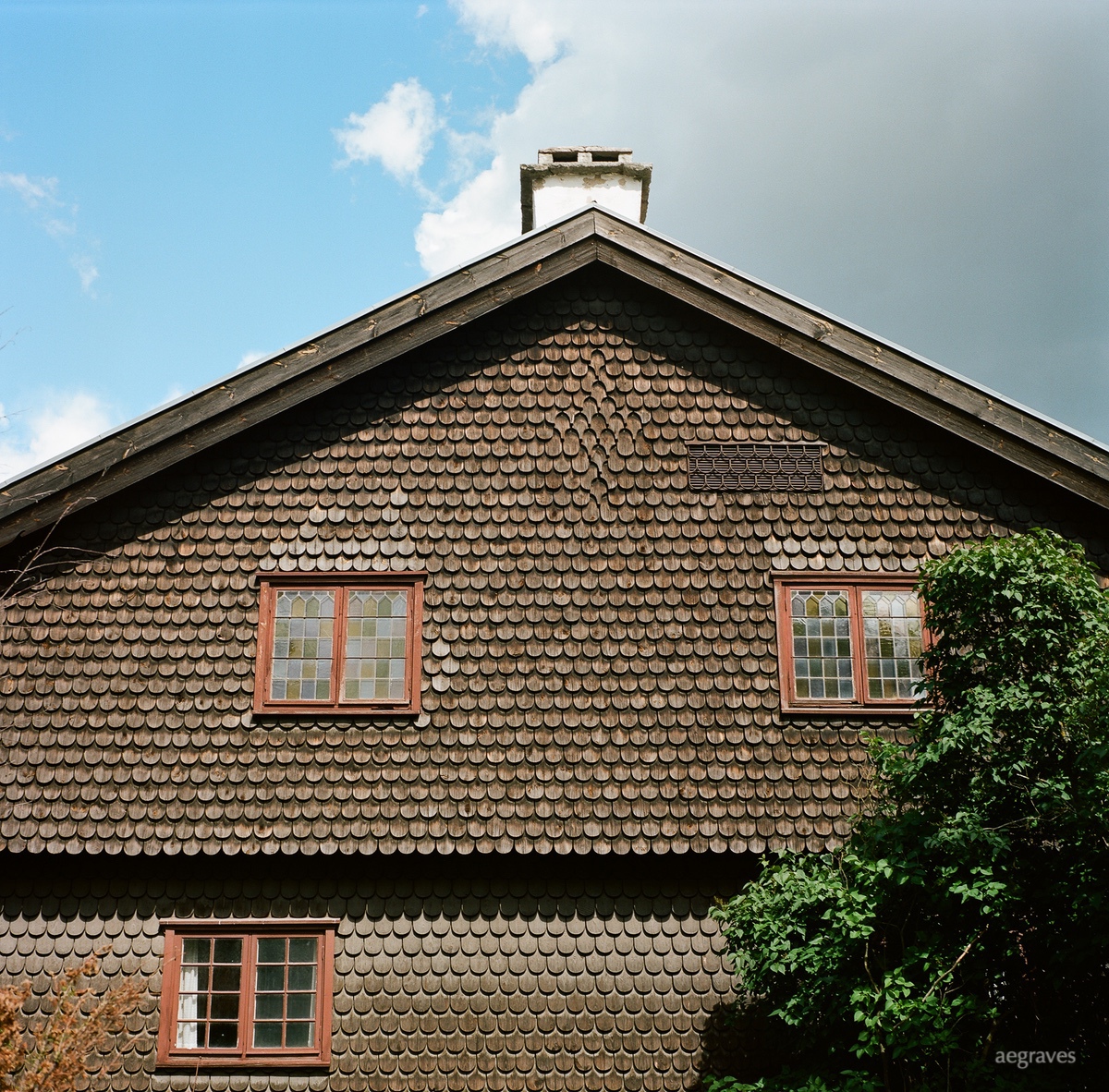
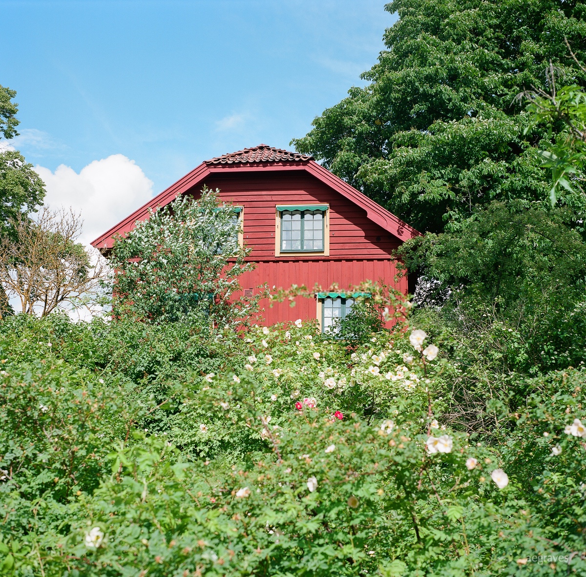
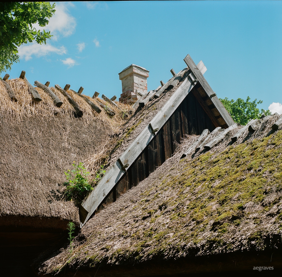
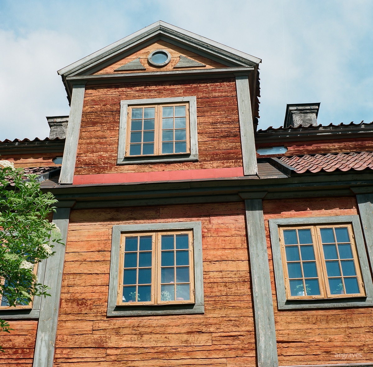
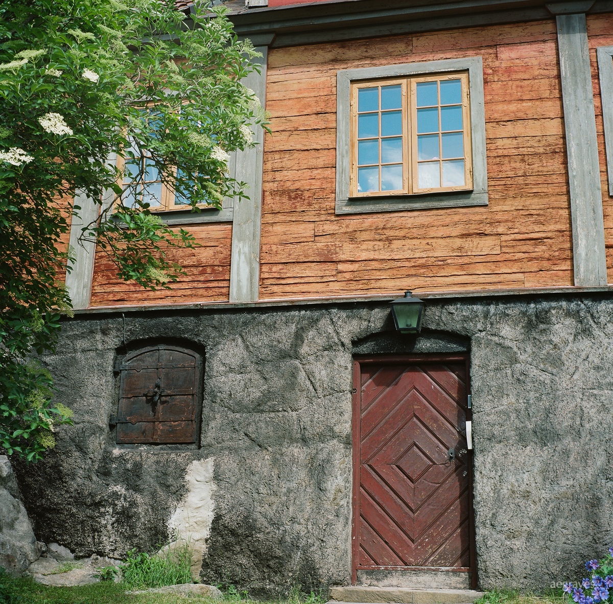
I’ll share some of my least characteristic color images here: urban studies in Sweden from 2013, which I just found the scans for (in a box, on a CD!). These images are from central Stockholm AND from Skansen historic park, which has a collection of historic buildings from around Sweden arranged in a village-like setting, with exhibits (and actors) showing the hard work required to live (and farm) so far north.
While my casual, colorful, horizontal vacation photos showed bicycles and cafes with pretty flower boxes and small windows, these photos lean toward geometry in architecture. I shot these on a large, twin lens reflex camera, which helped me develop new compositions. Yes, this antique camera bulky, but it has a great lens (or two!), has a bright focusing screen (on the top!), and inspires very different compositions than my decades of shooting 35mm horizontal images did. (I have been posting Polaroids recently, so these images may seem consistent with those, but I got comfortable with that format only AFTER I practiced with a TLR.)
These aren’t my best images, but I learned while shooting them, and found ways to record the interesting mineral pigments that are used so widely in both historic and contemporary Swedish design. (The reds and golds are my favorites.) I also learned that it is BRIGHT in Sweden in summer!